It can be tempting to go neutral when space is tight. But actually, by getting the ratio of bold to pale colors just right, a small living room can become an impactful and vibrant space, full of personality and charm.
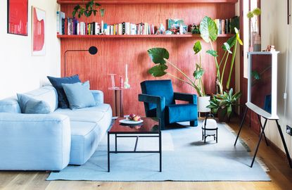
Livingetc's resident color expert Ruth Mottershead - who is also the creative director of Little Greene - knows the perfect formula. Based on this example of a bold red and pale blue living room by Spanish creative studio Plutarco, the trick is in the split between bright and calm, in matching tones and finding the right pigment. She explains how it's done.
Use brighter, more powerful shades in smaller proportions in a space – just 10 or 20% of an entire scheme.
Ruth Mottershead

Find the right tonal variation
At first glance, this living room color palette is simply blue and red, yet the scheme has been smartly put together using tonal variations of both of these colors, building depth and texture. Rich warm shades are a great balance as colors that go with light blue. Doing so is an effective way of adding layers to a scheme, playing with light to create interest and movement without the need for a new color. To create a sophisticated finish, pick out architectural features using a color scale and paint the walls, ceiling and skirting in variations of the same hue.
Use a split of 10 to 20%
Bronze Red Absolute Matt Emulsion by Little Greene
Although red features heavily in this space, the muted, natural wood tone of the living room wall ensures that it doesn’t feel too dominant. Its diluted strength combined with the darker grain of red adds something natural to the scheme, softening the room. The brighter red accents are a stronger version of the wall color – they add vibrancy, punch and dynamism. These shades tie the room together, each reacting with their counterpart to create a complete look. Use brighter, more powerful shades in smaller proportions in a space – just 10 or 20% of an entire scheme.
The brick red on the door is deeper than the other reds – its strength grounds the scheme whilst the lamp ensures the blue on the ceiling does not sit in isolation. An interesting use of gloss finish means the red is also reflected in both the table and ceiling, drawing these elements into focus and helping to balance the scheme.
Look for warm pigments
Sky Blue Absolute Matt Emulsion by Little Greene
The gloss paint on the ceiling is a warmer tone of blue than the paler blue living room rug and couch. (As a side note, light blue sofas seem to be very on trend right now!) Its green undertone means it acts as a neutral – neither too warm nor too cool. The ceiling provides an easy relationship for both the red and cooler blue tones within the scheme, meaning there is no uncomfortable feeling between the juxtaposing tones. It would be in danger of feeling flat and isolated if it were painted in a matt finish; instead, the gloss allows for the reflection of both the red and pale blue tones, ensuring an encompassed, balanced result.
Find a bridging piece of furniture
The blue velvet chair acts as a bridge between the red and pale blue. This dark, rich blue has warmth within. It feels cosy, inviting and, along with the dark blue cushion, creates a link to the paler blue, which is much colder in comparison.
Use white with a yellow base
Silent White Pale Absolute Matt Emulsion by Little Greene
The walls read as white even though they have yellow undertones, which provide comfort – a more brilliant white would make the environment feel cold and fight with the red for prominence. The warmth of the undertones relates to the oak wood floor, ensuring harmony within the room. The off-white walls create a backdrop to the accents of pure white, found in the accessories and art pieces, making them subtle highlights within the space.
Play with dark accents
Dark accents like the coffee table, lamps and TV stand add geometric structure. They each have a connection with the floor, grounding the scheme in a consistent and striking way. Their architectural similarity means neither is more prominent than the other: although striking in their tone, they are easy to live with and provide for a comfortable environment.
Subtle pinks in the side table, the candle and the vases add further tonal variation to the red. These diluted colours allow continuity of the palette, adding interest and accents whilst retaining a direct relationship with the hero color.
Finish with a plant
As a finishing touch, the green plants soften the space. Planting is often introduced to a room for this purpose. The differentiating green tones within the leaves combine with other subtle green elements within the space, such as the candlestick and plant pot, which ensures any tension is softened – creating an overall more comfortable space.
-
These 12 Best Table Lamps for Your Desk — Perfect Glows for a Creative Home Office
The best table lamps for your desk is have a soft, targeted glow. Elevate your WFH set-up with these stylish picks endorsed by Style Editor Brigid Kennedy
-
The Nespresso VertuoPlus is 30% Off for President's Day, and it's Kim Kardashian's Coffee Maker of Choice
This sleek and stylish coffee maker was spotted in Kim's home bar, and you can currently save $60 if you buy yours from Amazon