
You might have noticed a trend for painting ceilings and walls in the same color in interior design of late. It's a phenomenon that's come to be known as 'color drenching' – painting the ceiling and all four walls in exactly the same shade.
It's undoubtedly become one of the biggest paint ideas of the moment, used in homes across the world, spanning all kinds of interior design styles.
Yet the question remains - should I paint my ceilings and walls the same color? To find out exactly what effect the color-drenching trend has on your space, we asked designers and paint experts for their advice. Plus, we've collected up some excellent examples of how to color drench a space to great effect.
Should you paint ceilings and walls the same color in every room?
To understand whether you should paint ceilings and walls the same color, first you have to grasp the effect that doing this has on the space. Color drenching functions in a few ways, not only affecting the overall atmosphere of a space, but also playing tricks with a room's proportions.
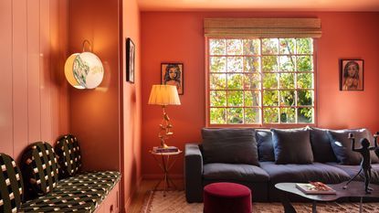
'Painting the walls, woodworks and ceiling in the same color is a great way of creating a cohesive vibe in a place, creating both depth and harmony,' explains Kathrine Errboe of Danish paint brand File Under Pop. 'It ties the room together and creates a calm canvas for other elements.' It's why color-drenched rooms feel modern and fresh - there's a minimalism to them that gives even spaces with traditional features a contemporary feel.
Painting the ceiling the same color as the walls can also help a small room look larger, especially in rooms that have low ceilings. It acts to blur the lines between walls and ceiling, giving both the sense that the ceiling is higher and the walls are further away. Yet, there's also something cocooning about opting for this one-color look.
You might also find that the juncture between different colored walls and ceilings feels a bit clumsy, especially in a room without crown moldings. This idea helps to blend the lines.
There isn't, necessarily, a type of room that color drenching should be used for, but you might want to question whether a room would benefit from a different color on the ceiling and walls. Do you want a contrast to draw the eyes up to a feature ceiling, for instance, or would a tonal color complement the scheme more?
Regardless, interior design trends are seeing plain white ceilings on the out, so why not try color drenching when decorating your next room? Here, designers and paint experts explain how to get the look right.
1. Use color drenching in a small room

Many home decorators get hung up on the idea that a white ceiling means a brighter space that feels larger, but actually, the introduction of another color onto the ceiling can just serve to highlight the proportions of a small room.
'The idea of 'drenching' a room, particularly a small space, is brilliantly bold and hugely effective in making a space feel bigger, seamless and contemporary,' says interior designer Lizzie Green. In this small home office, packed with storage, it could feel claustrophobic, but the one color choice actually helps the space feel calm and relaxing. 'The Red Earth shade used here is wonderfully cozy and inviting in this small study space within a Georgian home,' Lizzie adds.
2. Paint walls and ceiling the same color to zone a space
If you aren’t looking to decorate the whole space and are just creating a zoned area such as a home office area, consider your existing palette carefully.
'Accentuate a zoned space by drenching with color, including across the ceiling for a dramatic design feature,' says Ruth Mottershead, creative director at paint brand Little Greene. 'A contrasting color will clearly define an area, creating focus and design interest, whilst a more subtle color change such as using the same shade in a lighter or darker hue will create a more harmonious transition.'
'It’s important to consider how you use the wider space, a bold, vibrant zone works fantastically well in a kitchen, dining or living space,' Ruth suggests, 'whereas a more muted and calming approach will create tranquility for a relaxing bedroom.'
3. Include moldings, doors and trims and more in your color drenched look
While painting the ceiling and walls the same color might count as color drenching, for a truly monochromatic color scheme include the other architectural elements of your room too.
In this space, created by interior design studio Collective Works, the color-drenching idea goes one step further, including not only the doors and cornicing, but even with furniture that plays into the tonal look. 'The ceiling, walls, crown molding and doors are covered in the same color, to create a comforting cave,' says Siri Zanelli, founder of Collective Works. 'This room gives you a welcoming hug when you walk into it.'
4. Or experiment with contrasts
When painting over trims, doors and architectural moldings, they become much less about the visual structure of your room, and more about introducing a texture to the space. For a bold, ornate feature, this may actually help to modernize the look, but you could still opt for a modern color-drenched idea without painting every surface the same color.
In this space designed by Nordic design brand Note Design Studio, a contrast door trim idea has been retained, highlighting it as a beautiful architectural element, but also framing the transition into the next room, a kids' room which uses a similar yellow palette.
5. Shift tonally from room to room
While you may only want to drench one room in a certain color, it's important your home still feels cohesive. Where different paint shades might have helped create a throughline in your space, why not try this tonal decorating idea by drenching adjacent rooms in similar shades?
'The dark Scandinavian winters make homeowners spend a lot of time inside,' says interior designer Hanne Gathe of Dactylion Design of this stylish blue-drenched space. 'This apartment has a moody color scheme that gives a cozy warm feel, from greys to blues and greens. '
'The sofa is in an emerald green that picks up on the blues, gives a contrast, but doesn't stand out. The end result is striking, but calm and cozy,' Hanne adds.
In the kitchen, a darker blue demarcates the two spaces, but still flows comfortably between.
6. Or go bold with your contrasts
Alternatively, choosing boldly different colors to drench neighboring rooms can create an unexpected, invigorating effect.
This home office created by interior design studio Lala Reimagined contrasts a vibrant electric blue, Farrow & Ball's Vardo, with a rich, warm terracotta in the neighboring den.
Is it easier to paint the ceilings and walls the same color?
Another benefit of embracing this trend? It's much easier when it comes to how to paint a room. You won't need to 'cut in' around the ceiling when painting your room, as long as you're using the same paint color and finish.
If you're color drenching around doors and trim, bear in mind that an eggshell or satin should be used for woodwork to ensure it's durable, and this difference in finish between the wall's matt emulsion might show if you're not careful in painting these elements separately. Of course, they'll show up mistakes far less than painting a contrast color for trims.
-
The 4 Things People With Really Organized Kitchen Drawers Always Have
Level up your ‘drawer decor’ and keep things tidy and organized with these 4 essential ideas for uncluttered storage
-
Experts say These 6 Paint Ideas are Devaluing Your Home — 'Be Sure to Redecorate if you Plan to Sell!'
Thinking of selling up? Avoid these paint colors to maximize the potential of your space and appeal to prospective buyers