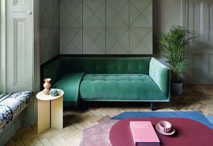
It takes a deft hand to be able to play with a color palette as strong as this one, in this living room designed by the studio Kingston Lafferty. Vibrant greens sit next to a burgundy table, a blue rug, a yellow side table. There is no rest for the eye, yet somehow, the overall effect is somewhat...soothing?
The rules of color theory would never tell you to put all these shades together. Yet undeniably, they work. And there has to be a secret to it - a reason behind this kaleidoscopic room swirling together so peacefully.
And so we asked our resident color expert Ruth Mottershead, creative director of Little Greene, to explain exactly what was was done here, and how anyone can pull it off at home.
The colors have a similar power. This is an unusual approach and we often shy away from colors of similar strength
Ruth Mottershead
The secrets to pairing vibrant colors in a relaxing room

The chroma of each color in this living room is diluted in this scheme, and these muted tones of stronger colors achieve gentle relationships with one another. The scheme also offers greens of differing strengths, all of which have a similar root; this way of combining color provides gentle depth and balance to a scheme whilst the addition of contrasting colors, such as the purple and blue, add impact and dynamism without conflict.
Colors containing similar pigments naturally work well together like the paint colors here – although of differing strength, they have very similar makeup. Acting as a neutral canvas, this particular soft green wall color is neither too warm, nor too cool – it contains a little warmth, and in turn creates a relationship with the pink and purple tones within the rug and table. The warm, darker blue in the rug juxtaposes the purple in a rather sophisticated fashion because of its related color (there is some magenta in both).
Blue Verditer by Little Greene
The colors have a similar power. This is an unusual approach and we often shy away from colors of similar strength (they often fight with one another for applause) but in this case, the Celestial Blue lampshade grabs our visual attention, leaving the more muted tones as a chorus of support.
Geometry in the artwork and parquet floor is strongly connected via their diagonal nature, leading the eye to the comfort of the daybed. There is a great textural impact which contrasts the soft furnishings but ultimately, it is the colors themselves that need to do the work in providing a soothing environment.
Pearl Color Mid by Little Greene
Soft green tones provide natural contrast to the strident color array. Their muted nature and pastel color also provides the perfect foil – it sits quietly in the background, exuding the tranquil ambience this room requires. When pairing and layering greens there are two approaches I recommend: the simplest route is to choose greens of similar tone in differing strengths, such as what we see here with the artwork and daybed (this provides harmony, as both greens complement one another). But for more tension, choose two greens with differing tones to infuse more dynamism and energy to a space.
Placement is as important as proportion when using minimal accent colors. I recommend using stronger, brighter tones sparingly as a highlight or to provide particular interest to a detail or feature. As a guide, no more than 5 - 10% of the scheme should act as a ‘pop’ of color. But the placement of color highlights is equally as important, as each color requires careful consideration to ensure connecting tones provide the appropriate level of excitement. In this case, elements such as the blue lighting that are more remote in terms of geographical location can be louder and more prominent than elements that are closer to other items within the room (for example, the yellow table sitting next to the daybed).
-
The 12 Best Table Lamps for Reading —I'm a Certified Bookworm (and Shopping Expert)
When it comes to table lamps for reading, I don't mess around. If you're the same, this edit is for YOU (and your books, or course — and good recommendations?)
-
"It's Scandi Meets Californian-Cool" — The New Anthro Collab With Katie Hodges Hits Just the Right Style Note
The LA-based interior designer merges coastal cool with Scandinavian simplicity for a delightfully lived-in collection of elevated home furnishings