
Irrespective of budget, we all want to give our homes that elevated, expensive feel. And it can definitely be achieved by choosing the right colors and materials. It’s also easy to get it wrong. One of the most important elements when creating the designer look in your home is choosing the right paint color for your walls. But with so many options that can actually make your house look cheap, it’s no wonder why some of us spend so long testing out dozens of shades before settling, still somewhat unsure, on a final choice.
While you’re trying to give your home an expensive look make-over, pick the wrong shade of white and you might actually achieve the opposite. Pick a tone that was on trend a while ago and now your home looks instantly dated. Sounds scary, but it needn’t be. I spoke to interior designers who revealed the 5 paint colors you should definitely steer clear of if you don't want your home to look cheap. They gave me their suggestions on what to get instead for an elevated, timeless look.
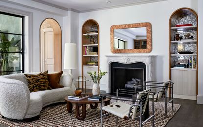
1. Pure white

Interior designers are very passionate about this. Way too bright and lacking in character, the pure sparkling bright white has no place in your home if you want to make it look anywhere near expensive. ‘To me, bright white walls scream "cheap rental!",’ interior designer Bethany Adams tells me. ‘I absolutely love a neutral color scheme, but choosing the right white is key,’ she adds. Right now it’s all about off-whites: whites with subtle undertones that give them a special appeal. ‘Look for something with undertones of other colors for more depth. My go-to is Benjamin Moore's White Dove,’ Bethany tells me.
When choosing white paint, it’s important to consider the finish. ‘Make sure to choose a flat or matte finish if you have an older home,’ explains Bethany. ‘Any hint of sheen will highlight cracks and imperfections, which makes your house look crummy no matter how expensive it actually was!’ warns the designer.
If you love the freshness of a crisper white, there are still options to choose from that have a very subtle undertone but keep that lightness. ‘In the realm of whites, Decorator’s White by Benjamin Moore takes the lead as my top recommendation,’ interior designer Liad Schwartz tells me. ‘Its subtle undertones of gray and purple contribute to a versatile and timeless palette, ensuring a refined and tasteful outcome for any interior space,’ he says.
2. Basic gray
There are so many other more interesting, warmer tones of gray out there that look so much more sophisticated and now than the old basic version some of us still find hard to let go of. ‘This “builder grade” gray has been completely overused in the last 10 years, becoming the benchmark color for spec homes and homeowners who hastily update their homes right before putting them on the market,’ says interior designer Diana Lombard.
This doesn’t mean that you should steer clear of gray altogether, but as we’ve come to discover, it’s about the type of color we choose, and its subtle nuances in tone that can make or break a scheme. ‘If you want to go gray, opt for either a greige paint or a less recognizable gray,’ advises the designer.
‘One favorite that checks both boxes is Stonington Grey by Benjamin Moore. This grey is a versatile, adaptable, that has very neutral undertones, and can read cooler or warmer depending on the light. It's an easy-to-use grey that works in a variety of applications and transitions well between more modern and traditional spaces. For a soft, cool grey that works beautifully as an all over paint, I love Apparition by Benjamin Moore. This elegant, cool gray almost reads as a neutral. I used it for the entire first floor of a home renovation and it literally transformed the space from drab to stunning,’ she says.
3. Primary colors
These days, you can’t just pick a color and get on with painting. It’s too easy, and it will show in the finished look of your home. It’s not just any red, green, blue or yellow in their pure form. There needs to be thought put into what mix of undertones takes a color from basic (and yes, cheap looking) to interesting and elevated.
‘In interior design, the reliance on decorating with primary colors has become a thing of the past. The use of such colors can inadvertently lend an air of cheapness to a space,’ Liad tells me.
Take for instance, the color green. You love it, you want to bring it into your home somehow, so you need to take it a step further. ‘To achieve a more sophisticated and inviting ambiance, I advise incorporating muted versions of greens, such as Benjamin Moore's Pinelands or Sweet Basil, as they impart a cozier aesthetic,’ advises the designer. Green is no longer ‘just green’.
Or take red as another example. You love the vibrancy and warmth of it and want to inject that element into your design. Don’t settle for plain red - dig deeper into its myriad tones that will create a moody, elevated look. ‘When considering the inclusion of red in your design, opting for a moodier and more saturated shade, like burnt red, can be particularly effective as seen in Benjamin Moore’s Dinner Party. This choice not only provides high contrast, but also exudes a heightened sense of energy without veering into overly vibrant territory,’ Liad explains.
And if it’s the opulent feel that red brings to a space that you’re after, there are alternatives worth considering too. ‘For those aiming for an opulent and luxurious look, aubergine stands out as an expensive-looking color choice. Dark Burgundy by Benjamin Moore would be a fantastic pick,’ adds the designer.
4. Baby blues and pinks
When looking to create a soft, warm, and welcoming interior, one might think that decorating with pastels are the way to achieve that. And while there is a time and place for powder pink and baby blue, it’s not in a home where you’re looking after an expensive feel. What you’ll risk achieving is the opposite. ‘Overly pastel paint colors can cheapen a home, especially when they are used in primary living areas,’ warns Diana. ‘Baby blue and cotton candy pink are fine for a kids room, but put them in your living room and suddenly your home could look very kitsch-y,’ she adds.
If you do love blue, Diana advises to opt for deeper, richer shades instead. ‘One personal favorite is Hale Navy, a timeless, classic navy blue by Benjamin Moore that is inspired by the architectural colors from the 17th and 18th centuries. A deeply saturated color with subtle grey and green undertones, Hale Navy is extremely versatile. It works well for cabinetry and built-ins as well as family rooms, dens, and offices. It is also an excellent choice for exteriors and front doors. This color is a true, sophisticated navy blue that will never go out of style and definitely one of my go-to blues,’ she explains.
And when it comes to baby pink, there is a wealth of so much more sophisticated alternatives out there, and some will look great in a living room. Think more ‘dusty pink’ instead. ‘Dusty pink can be stunning when used correctly,’ says Diana. ‘A very light pink with grey undertones will almost read as a neutral, especially when offset against darker colors. One favorite is Peignoir by Farrow and Ball. This mellow, warm pink is reminiscent of a plaster finish, which is highly sophisticated and welcoming, and can work beautifully on walls or cabinetry,’ she adds.
5. Loud turquoise
We’ve certainly seen a flash of turquoise in so many homes, be it in the soft furnishings, as an accent wall, or on all the walls in rooms that look to feel vibrant and energizing. Well, while the color might energize for a short period of time, live with it for too long in a home environment and it will become cheap looking, fast. ‘Bright turquoise evokes images of the tropics, and unless your home is a vacation rental on the beach, it can feel flashy and garish when it's overused in a home,’ says Diana.
The designer tells me, however, that you can still achieve the same vibrant effect by opting for richer shades of turquoise, as accents in your space. ‘They beautifully compliment a myriad of other colors, such as mustard yellow, coral, grey and even navy. Bermuda Turquoise and Galapagos Turquoise by Benjamin Moore are two of my favorites. I recently used the latter as an accent wall in a home office and it was stunning, and just specified the former for a fireplace accent wall in a family room,’ she advises. When choosing the color for your walls, always think away from the basic versions, that can create a cheap look. Search for tones and shades that elevate a color and give it interest and depth.
Price: $79.99/ 1 gallon of ADVANCE® Interior Paint
This white has a hint of grey in it which gives it depth.
Price: from $140 per gallon
This romantic pink has a slight touch of grey to give it a sophisticated, more grown up look.
Price: $79.99/ 1 gallon of ADVANCE® Interior Paint
Avoid bright primary colors, and go for natural looking tones instead.
-
These 12 Best Table Lamps for Your Desk — Perfect Glows for a Creative Home Office
The best table lamps for your desk is have a soft, targeted glow. Elevate your WFH set-up with these stylish picks endorsed by Style Editor Brigid Kennedy
-
The Nespresso VertuoPlus is 30% Off for President's Day, and it's Kim Kardashian's Coffee Maker of Choice
This sleek and stylish coffee maker was spotted in Kim's home bar, and you can currently save $60 if you buy yours from Amazon