
If you've scrolled your favorite social media platform of late, you might have come across a viral video about the "Unexpected Red Theory". I'm an interiors editor, and have spent a fair amount of time talking to some of the world's best color experts about how they decorate, but it's not something I've come across before. So what gives?
The term was actually coined by TikTok user Taylor Simon, @intayriors, who explains that the idea behind it is that a seemingly random injection of red into a room will make it look more elevated. I'll always take an interior design trend that originates from TikTok with a pinch of salt, but when I thought about this "theory", I quickly realized this might be a calling card that some of my very favorite interior designers have in common.
So, is the "Unexpected Red Theory" real? And how do you introduce red 'into a room where it does match at all', as Taylor explains it, successfully? I asked these interior designers from around the globe, each of whom uses red as a clever element of their designs, to get their advice on how it's done.
The power of red

In the examples of this color theory going viral, it's a classic, nearly-primary shade of red you'll see as the prime example of how this idea is implemented. So why red? Why not an equally shocking intervention of blue? Orange? Bright pink? 'Shades of red can really ignite a space, providing a visceral glow,' Yasmine Ghoniem, founder of YSG Studio, tells me.
'It is bold yet classic and surprisingly versatile as it goes with everything in small doses,' adds interior designer Eddie Maestri, founder of Maestri Studio. 'It adds drama and energy to a space. It’s nice to incorporate a small pop of red in accessories now and then just to make sure space comes alive.'
For Roisin Lafferty, founder of interior design studio, Kingston Lafferty, it's red's emotive power that makes the use of "unexpected red" so engaging. 'Color is powerful and sub consciously evokes a lot of emotions, in particular red,' says Roisin. 'Red is bold and dominant, therefore when used, we feel it either needs to take centre stage or have strong colours, textures and shapes to work alongside it. Choosing red tones encourages people to act and feel differently within the space — it's sexy & powerful,' she adds.
@livingetcofficial ♬ Sunshine - WIRA
How to make red feel "unexpected"
Okay, so unexpected red sounds good in theory, but to put how these designers use red as simply 'not matching the room' is to perhaps do a disservice to how deftly they wield it in their designs. What's the difference between using red in an unexpected way, and just using red?
We might better characterize this color trend by saying that a room's palette could exist just as easily without this introduction of red. This might, in this instance, be your room's existing color scheme, where red might be a left-field addition, on a small scale, but one that might just add a new dynamic to your space.
For Roisin Lafferty, this use of red is less about being random, and more about it making the right impact. 'Using red as a sole color within a space can make it appear unexpected,' she says, 'however; if using solely it needs to appear dominant to act as a statement piece. This can be achieved by using the color red in a contrasting furniture style to allow it to shout, or oversizing a red piece of furniture, where everything else appears in the background yet compliments this feature element.'
While Roisin's designs see red used among a kaleidoscope of other colors, for interior designer Yasmine Ghoneim, it can be a powerful addition to a make a palette come alive when decorating with neutrals. 'We tend to go for the warmer hues en masse like painting a ceiling or feature wall with a velvety Marmorino or French wash finish, and save the more vibrant, brighter reds for accents like joinery trims or a feature piece of furniture for example,' Yasmine explains. 'Using strong tones upon white walls can create pause points in a home, so just choose areas, not an entire room if you’re feeling hesitant about living in the intensity of a strong red in particular.'
Eddie Maestri agrees in how to use red: 'Definitely small doses. Too much of it can be overwhelming,' he says.
Rooms that make "unexpected red" work
The best explanation of "Unexpected Red Theory" is, honestly, to see it in action. Here are some of my favorite projects from YSG Studio, Kingston Lafferty and Maestri Studio where red has been used in a brilliantly unexpected way.
1. This kitchen with a hidden red pantry
This kitchen design by Maestri Studios might be the very definition of unexpected red, as the kitchen cabinet doors open to reveal a pantry painted in a energetic shade of red. 'As a hidden pantry, the use of red is just that, unexpected and bold,' Eddie explains. 'When the door is open, that view of the red has a lot of visual impact against the black and white palette of the kitchen,' he adds.
The rest of the space also employs soft green tones — and red and green don't always make easy bed-fellows outside of Christmas, making this use of the color even more unexpected behind these closed doors.
2. This cabinetry with a bold red accent
'In this residence we introduced this dreamy natural red pigmented quartzite stone to the kitchen which frames the backdrop enticing you to touch, feel and interact with the space,' Roisin from Kingston Lafferty explains. 'To complement this vein enriched stone we populated the kitchen throughout with subtle hints of vibrant red tones in the form of door handles and accent lights. These accents of red offset against the rich tones of rosewood timber blending harmoniously creating a dreamlike, sensual environment.'
For many designers, this red wouldn't be a natural accent to pursue against the teal-blue surfaces, and it even feels like it speaks a different language to the naturally elegant stone kitchen countertops with its bold primary qualities. It's a bold choice, but one that makes this scheme feel electric and energized.
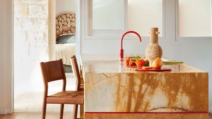
3. This holiday home with brilliant red features
'In La Palma, a holiday home in Sydney’s northern beaches with a sexy beat, deep Mexican reds and ochres stroke walls (and ceilings) giving it an instantly aged patina,' Yasmine Ghoneim, founder of YSG Studio explains. It's a home that has a relaxed, bohemian feel to it, but the design is made to feel fresh and exciting with a small injection of red in key places.
The most unexpected might be this red kitchen faucet, crowning the contemporary kitchen island. 'The brighter shade activates the kitchens island feature with an energetic pulse, sandwiched between two types of natural stone to enhance the complimentary pairing,' Yasmine says.
Against the natural rattan furniture and soft brown and terracotta tones, simple, graphic interventions highlighted in red bring some flair to the design. 'We painted a trip hazard a checkered red and white pattern leading from the lounge to dining table, giving it aesthetic appeal,' Yasmine says. 'Its pattern echoes that in a painting we specified (we had some fun extending the feature across the wall it hangs on too).'
What makes the use of red in these schemes "unexpected", rather than carefully and considerately designed into them from the outset is hard to define, but regardless there's a clear lesson to learn from these spaces. If you room's color scheme is feeling a little flat, why not try a bit of red? It might be just what you're missing.
6 perfect "Unexpected Red" buys
Price: $37.34
Material: Metal
Price: $150
Price: $31.99
Material: Acrylic
Price: $379.99
Material: Brass and velvet
Price: $299
Material: Travertine
Price: $22.50
Material: Zinc alloy
-
5 Trees You Should Prune in Your Backyard in February — 'It Makes Much Sense to Cut These Ones Back Now'
If you think pruning trees is best left to spring, think again. These trees all could use some cutting back now for several very important reasons
-
The 4 Things People With Really Organized Kitchen Drawers Always Have
Level up your ‘drawer decor’ and keep things tidy and organized with these 4 essential ideas for uncluttered storage
-
"Waterfall Sinks" are Going Viral — Here's What You Need to Know About This New Kitchen Trend
Waterfall sinks are set to be the next big thing, revolutionizing your day-to-day washing up. Take a look at some of the best out there...
-
"This Will Rival the Camaleonda" — B&B Italia's New Sofa Designs Look Set to be Big 2024 Trends
B&B Italia is known for so much more than the Camaleonda, but its sofa has really captured the moment. It's new couch designs will give it some competition
-
6 Brand New Design Trends Our Editors Spotted This Week in Paris — "They Make Spaces Feel Elegant and Cozy"
At Maison et Objet and Paris Deco Off, many of the world's best brands are launching new collections. Here's what has caught our editors' eyes and is setting the trends
-
Designers are Embracing This Desk Trend to Totally Shake up Home Office Layouts — It's so Much Better for WFH
New year, new you, new desk - what better way to kick off your working year than with a home office refresh...
-
"Near-Black" Wall Paints are The Most Dramatic Way to Decorate for 2024 — Here's How Designers are Using Them
Incorporating splashes of black in your interior is a surefire way to add dramatic ambiance to your home - these are our five favorite examples of the trending shade in action
-
The 5 Metallic Finish Trends Interiors Designers Want you to Know About for 2024
Some classic materials are being reinvented with a contemporary twist
-
From Furniture to Paint — Why "Olive Pits" Might Just be the Next Big Sustainable Design Trend for Your Home
Designers are finding new, and diverse, uses for this emerging bio-material to manufacture products for our homes
-
I'm Obsessed With This New Kitchen Countertop Trend (I Think It Could Be Replacing Granite!)
This is the new kitchen countertop trend to watch – it's so sleek and beautiful